
After finishing my bachelors thesis I wanted to continue improving my data analytics skills. Therefore I was looking for datasets that where open source, offered a big amount of data and interesting to analyize. Although there were plenty of options I decided to work with data reporting New York shooting incidents between the year 2006 to 2018. The dataset was published at data.gov for public access and use containing labels like:
- Identification number
- Occur date and time
- Location by longitude and latitude
- Statistical murder flag
- Age group and gender of perpetrators
- Age group and gender of victims
As programming language I wanted to use Python 3 again due to its rapid
development
speed. Also I was looking forward to exploring
more of the functionality the data analysis library Pandas offers. For data
visualization I used Matplotlib by which I was able to
plot data in suited ways. Nevertheless for publishing my results on my website I switched to
Chart.js. The dataset itself can be downloaded in different formats like
CSV, JSON and contains 20.660 entries. Pandas
offers multiple functions to read files in DataFrames. I was able to read the
dataset
from a CSV file into a newly declared DataFrame
by calling the read_csv() function and passing the files path. In the following
you can
see some interesting results I was able to
extract from the dataset.
    # Read data from csv in DataFrame
    data = pd.read_csv(PATH_TO_DATA)
# Extracting general knowledge
To get a general understanding of all columns and their meanings, I created different functionality to display any informations like the number of shooting incidents recorded by NYPD since 2006. Below chart visualizes the number of shooting incidents from 2006 until 2018. You can see how the overall number of incidents generally decreased with time.
Shooting incidents by year
Thurder more I calculated the likelyhood to die in shootings by counting the number of all
entries
where the STATISTICAL_MURDER_FLAG
was set True and dividing the result by the length of the dataset.
    # Check if murder flag is true
    for entry in data:
        if entry:
            murder_counter += 1

    # Calculate and return percentile of murder by incidents
    murder_rate = round((murder_counter / len(data)) * 100, 3)
I also tried to describe a perpetrator and victim by gender and age group. Unfortunally there is a high number of unknown pepatrators whereby I was not able to exactly specify perpetrators. This could be if a high percentage of perpetrators were not caught but it's just a hunch. Nevertheless you can see some facts below.
Perpetrators
Victims
General murder rate
# Investigation of recent incidents
After extracting general information of the whole dataset, I wanted to explore current data.
For
this purpose I kept myself busy
by analyzing every entry which was added in 2018 and displays newest recordings. This could
be
realized by iterating through the
dataset line by line and checking if the column OCCUR_DATE inherits 2018 as
specified
year. To reduce computation
power needed to process the DataFrame, a copy containing all entries from 2018
was
created. Below are several gathered
informations refering to newest data.
# Filter data by year and append row new DataFrame
for index, row in data.iterrows():
if ("/" + str(year)) in str(row["OCCUR_DATE"]):
altered_data = altered_data.append(row, ignore_index = True)
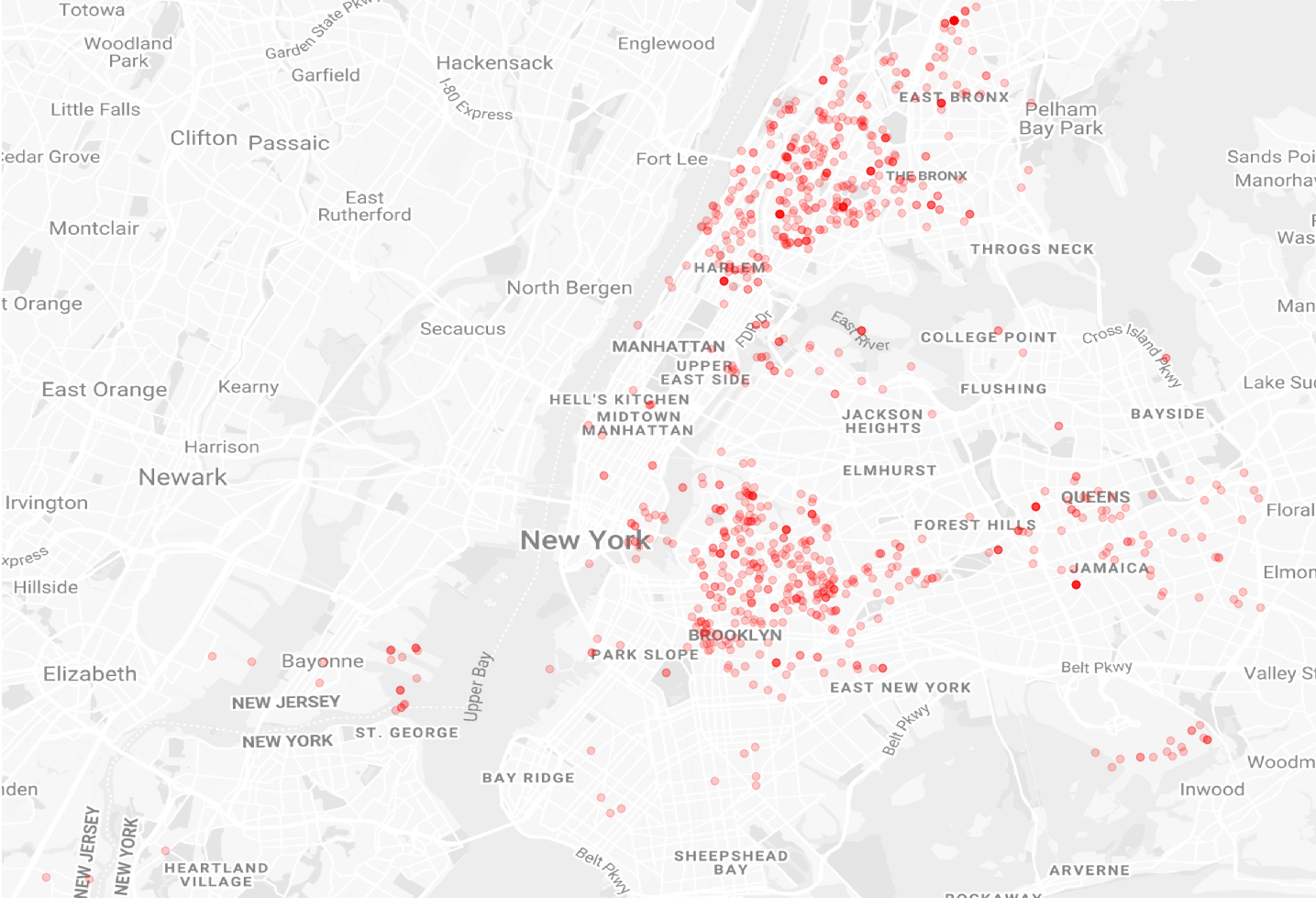
# Define min and max longitude, latitude
bounding_box = [-74.24930372699998, -73.70308204399998,
40.51158633800003, 40.910818945000074]
# Get background image
image_map = plt.imread(r"../data/map.png' %})
# Plot data
plt.scatter(altered_data["Longitude"], altered_data["Latitude"],
c="r", alpha=0.2, zorder=1)
...
To find certain shooting hotspots I took all incident locations from every entry in 2018 by longitude and latitude. This allowed myself to plot every incident on the map of New York. Every red dot displays an incident, whereas transparency decreases when multiple incidents happended at the same location. As you can see there are two main hotspots for criminal activity:
- Harlem / The Bronx
- Brooklyn
Locations of reported New York shooting incidents in 2018
I next wondered if shooting incidents depend on seasonal conditions. This should be visible by analyzing the number of incidents on a monthly base. As you can see in the following chart there are definitely more incidents in warmer months than in autumn/winter except January. This might correlate with drive for change at the beginning of every new year but still a hunch.
New York shooting incidents in 2018 by month
Next to seasonal dependencies, I wanted to get the most likely daytime for shooting incidents. I excepted it to be at night but still wanted to check my thesis.
    # Count shootings per hour of day
    for entry in data:
        hour, _, _ = entry.split(":")
        if int(hour) not in hour_counters:
            hour_counters[int(hour)] = 0
        else:
            hour_counters[int(hour)] += 1

    # Sort dict by hours
    sorted_hour_counters = OrderedDict(sorted(hour_counters.items()))

    # Plot shootings by month
    plt.plot(sorted_hour_counters.keys(), sorted_hour_counters.values())
        ...
As you can see there's definitely an uptrend after lunch peaking at 9pm. There's clearly a higher number of incidents between 8pm and 4am.
New York shooting incidents in 2018 by daytime
In total a pretty interesting dataset. Looking forward to practice my data analytics skills with new datasets. You can find the complete code I developed for this dataset on my Github repository!
Context
Private
Tools
Python, Pandas, NumPy, Matplotlib
Contributors
None
Published
Jan. 16, 2020
Source